Key takeaways
- Most AI visibility platforms were designed with data teams in mind, and it shows. Non-technical marketers often hit walls within the first 15 minutes.
- The clearest dividing line isn't features -- it's whether the platform tells you what to do next, or just dumps data on you.
- Platforms like Promptwatch, Otterly.AI, and Peec AI prioritize clean, accessible interfaces. Profound and Scrunch lean toward power users and enterprise teams.
- Crawler logs, prompt volume scores, and content gap analysis are the features that separate "nice dashboard" from "actually useful tool."
- If you're a solo marketer or small team, start with something that surfaces recommendations automatically. You can always graduate to a more complex tool later.
Why the UI question matters more than you'd think
There's a version of this conversation that focuses purely on features: which platform tracks the most AI models, which has the biggest prompt database, which covers the most regions. Those things matter. But they're almost beside the point if the person running your AI visibility program opens the dashboard on a Monday morning and has no idea what to look at.
The AI visibility space has exploded since 2024. What started as a handful of citation-monitoring experiments has turned into a crowded category with platforms at every price point and complexity level. Some are built for enterprise data teams with dedicated BI resources. Others are clearly designed for a marketing manager who has 20 minutes between meetings.
The problem is that most platforms don't tell you which one they are until you're already inside.
This guide cuts through that. I looked at the actual user experience of 10+ platforms -- what you see when you first log in, how hard it is to set up your first prompt, whether the dashboard explains itself, and whether a non-technical marketer can get to an actionable insight without needing a walkthrough from a customer success rep.
What "usable for non-technical marketers" actually means
Before getting into specific platforms, it's worth being precise about what we're evaluating. "Non-technical" doesn't mean unsophisticated. It means someone who:
- Doesn't want to write SQL or configure API endpoints to see their data
- Needs the dashboard to surface priorities, not just raw numbers
- Wants to understand what's happening in plain language, not just percentages and charts
- Has limited time and needs to get to a useful insight in under 10 minutes
With that framing, here's what I looked for in each platform:
- Onboarding clarity: Can you get your first prompt tracked without reading documentation?
- Dashboard orientation: Does the home screen tell you what matters, or does it require you to already know what to look for?
- Actionability: Does the platform suggest what to do next, or just show you data?
- Language: Are labels and metrics explained in plain English?
- Depth vs. accessibility balance: Can a power user go deeper without the interface being confusing for everyone else?
The platforms, ranked by usability for non-technical marketers
Promptwatch
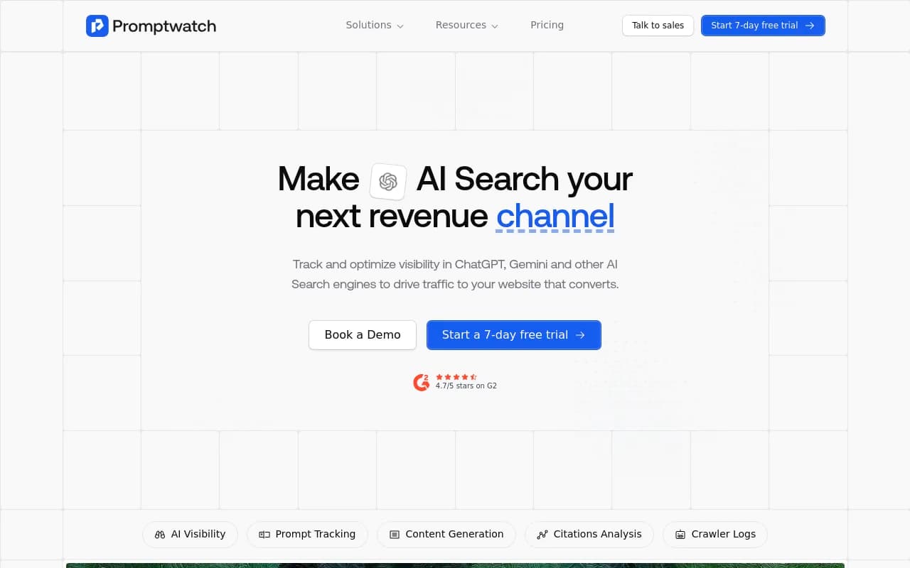
Promptwatch is the platform I'd hand to a non-technical marketer with the least amount of hand-holding required. The home dashboard is organized around a clear question: where are you visible, and where aren't you? The Answer Gap Analysis feature is particularly well-designed for non-technical users -- it shows you exactly which prompts your competitors are appearing in that you're not, and it explains why that gap exists in plain language.
What makes it genuinely different from a UI perspective is that it doesn't stop at the data. The Content Agents feature lets you generate content directly from the gap analysis, so the workflow is: see the gap, click to create content that fills it, track the result. That loop is visible and navigable from the dashboard without needing to jump between tools or understand the underlying data architecture.
The crawler log view is more technical, but it's tucked away rather than front-and-center, so it doesn't intimidate users who don't need it.
Otterly.AI
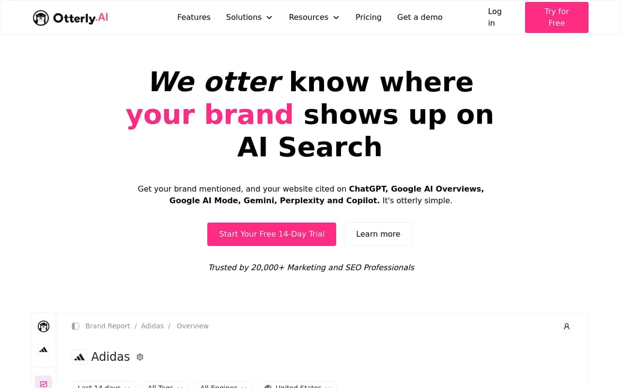
Otterly.AI is one of the cleaner monitoring-focused interfaces in the category. Setup is fast -- you can get your first prompt tracked in a few minutes -- and the share-of-voice charts are easy to read at a glance. For a marketer who just needs to know "are we showing up in ChatGPT and Perplexity for our core terms?", Otterly does that job without friction.
The limitation is that it stops there. The dashboard shows you the data, but it doesn't suggest what to do with it. If your visibility score drops, you'll know it dropped, but you won't get a recommendation for why or what to fix. That's fine if you have an SEO or content team who can interpret the data -- less fine if you're a solo marketer expecting the tool to guide you.
Peec AI
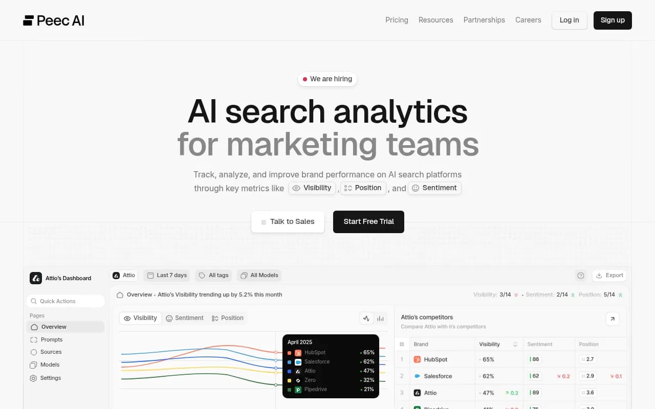
Peec AI has a genuinely strong regional reporting interface. If you run campaigns across multiple countries and need to understand how AI citation patterns differ by region, the geographic segmentation is well-executed and visually clear. Non-technical marketers who work in international marketing will find it intuitive.
The source URL tracking -- showing which domains are driving citations for your competitors -- is also well-presented. It's the kind of insight that would normally require a data analyst to surface, but Peec AI makes it readable for a marketer.
Where it falls short is in the same place as Otterly: it's a monitoring tool. The data is clean, but the next step is left to you.
Scrunch AI
Scrunch sits in what I'd call the "mid-market monitoring" tier. The interface is competent and the multi-model coverage is solid, but the dashboard is more data-dense than the others in this section. It's not unfriendly, but it requires more orientation time. A marketer who's new to AI visibility tracking will probably need 30-45 minutes to feel comfortable navigating it.
The competitive share-of-voice dashboards are well-designed, and the visual citation interface is accessible. But the overall experience feels like it was designed for someone who already knows what they're looking for.
Profound AI
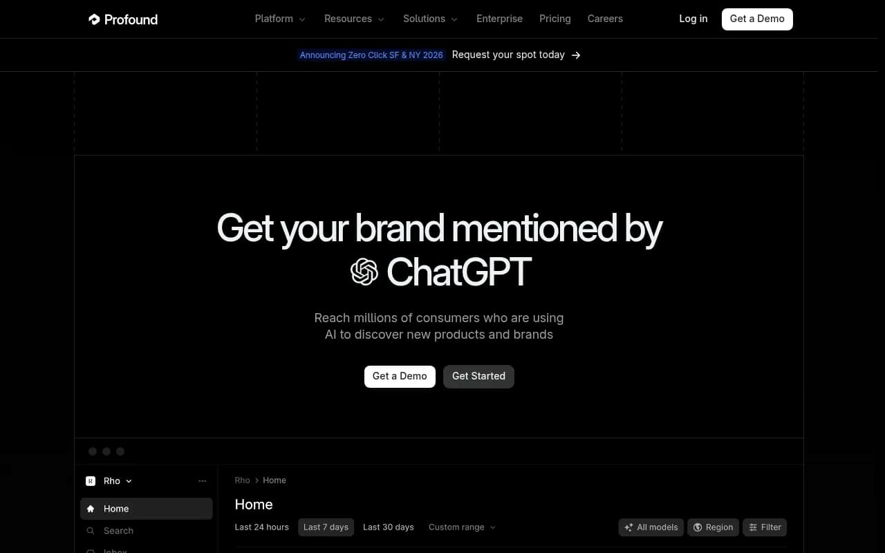
Profound is the enterprise benchmark. The platform has the most sophisticated prompt intelligence and the deepest data export capabilities of anything in this category. If you have a dedicated BI team and need to run complex analyses across thousands of prompts, it's genuinely impressive.
For a non-technical marketer, though, it's overwhelming. The interface assumes you know what you want to analyze before you open it. There's no "here's what matters this week" orientation. The depth is a feature for the right user -- and a barrier for everyone else. The price point ($500+/month at enterprise tiers) also means it's not a tool most marketing managers will be evaluating independently.
SE Visible
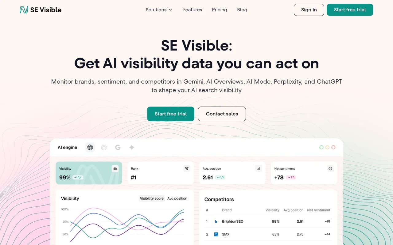
SE Ranking's AI visibility product (SE Visible) benefits from the parent company's years of experience building SEO dashboards for non-technical users. The interface is clean, the onboarding is guided, and the metrics are labeled in plain language. It's a solid option for teams that already use SE Ranking for traditional SEO and want to add AI visibility tracking without switching tools.
The AI visibility features are less deep than dedicated platforms -- prompt volume data and content gap analysis are limited -- but for a marketer who needs a simple, readable dashboard, it's one of the easier entry points.
Athena HQ
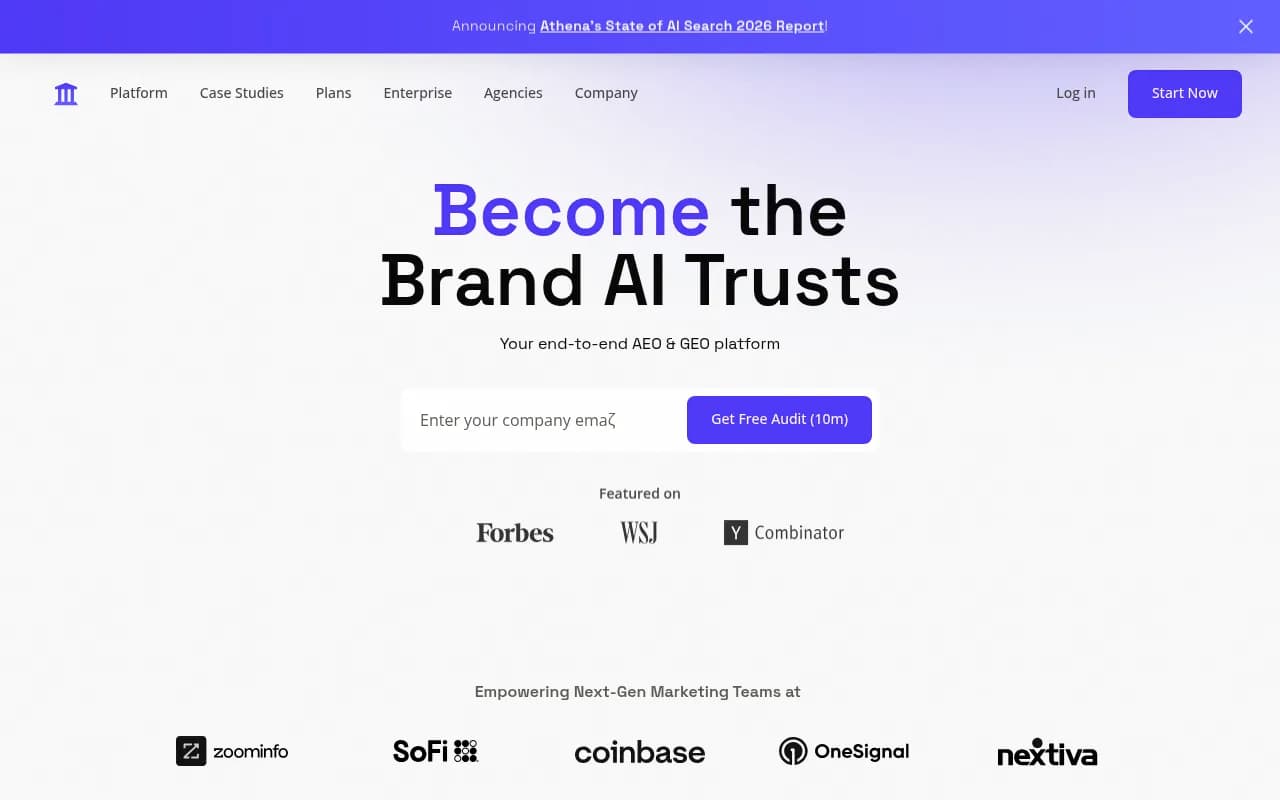
AthenaHQ has a clean interface and covers 8+ AI search engines, which is competitive coverage. The dashboard is organized and not overwhelming. But like Otterly and Peec, it's primarily a monitoring tool -- it shows you where you stand without helping you change it. The UI is accessible, but the lack of content optimization features means non-technical marketers will quickly hit the ceiling of what they can act on.
Brandlight.ai
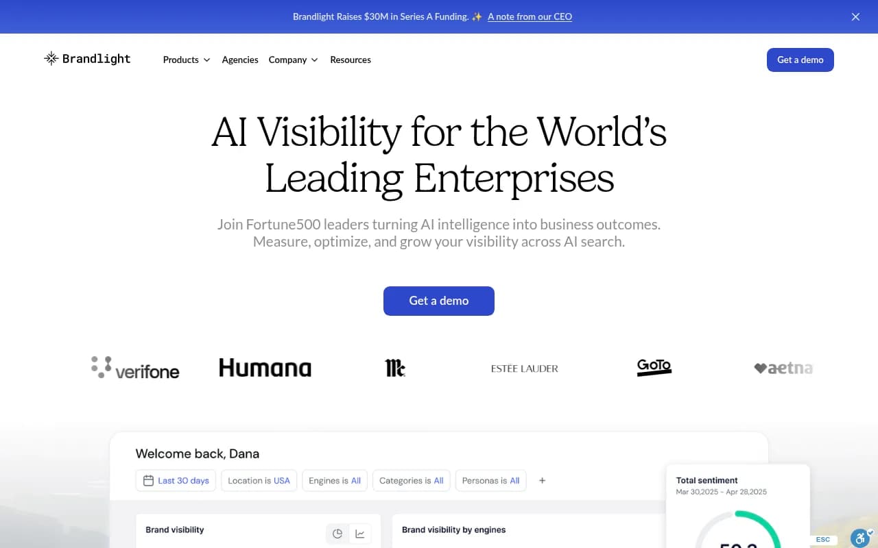
Brandlight.ai focuses on brand sentiment and citation monitoring across AI models. The interface is visually polished and the sentiment tracking is presented in a way that's easy to interpret. For a brand manager or PR-focused marketer, it's intuitive. For someone trying to drive AI search visibility through content strategy, it's missing the tools to close the loop.
Trakkr.ai
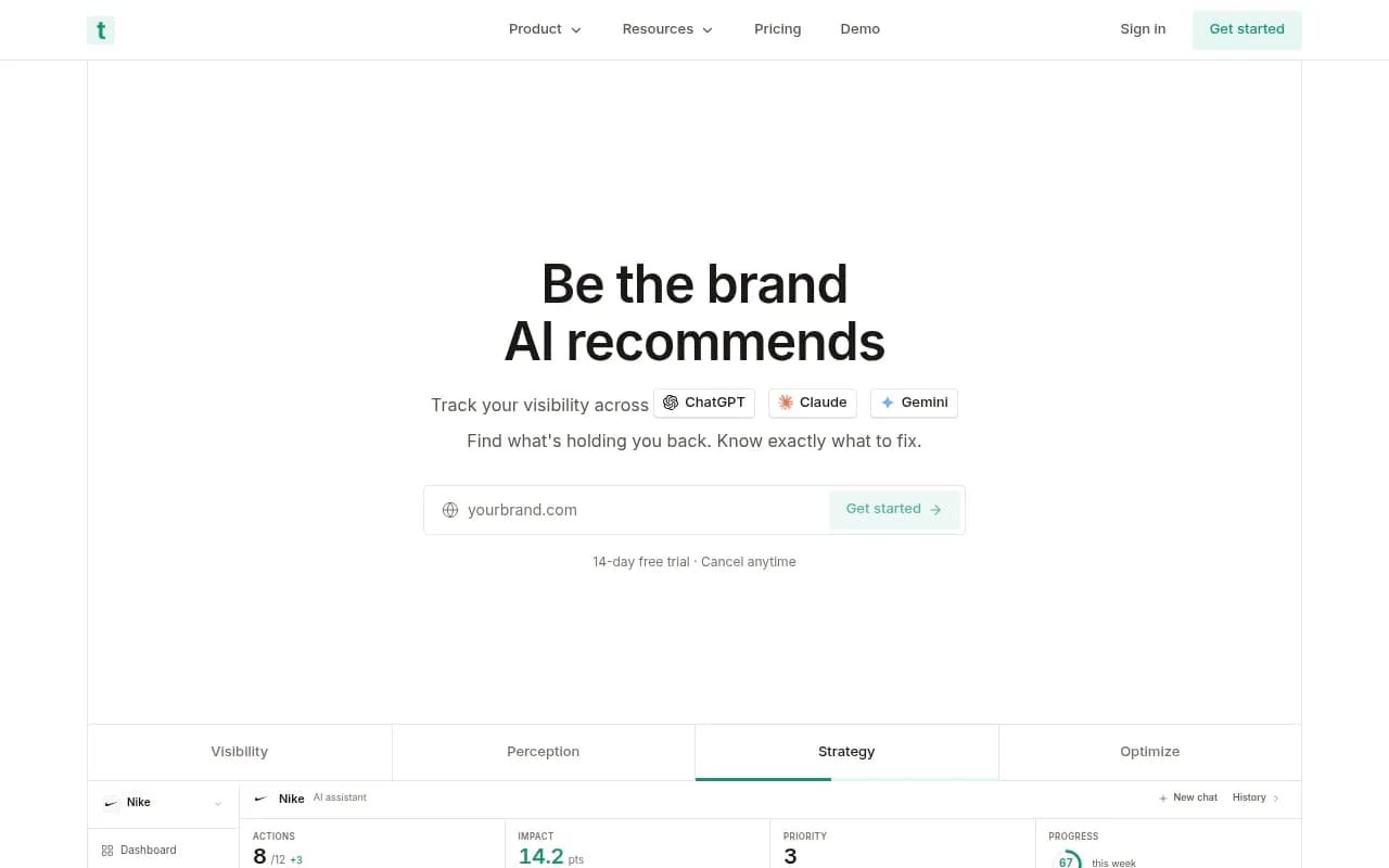
Trakkr.ai is a newer entrant with a simple, focused interface. It tracks brand visibility across ChatGPT, Claude, and Perplexity with minimal setup friction. The dashboard is minimal in a good way -- it doesn't try to show you everything at once. For a small team or solo marketer who just needs a lightweight visibility check, it's one of the least intimidating options.
Wellows
Wellows sits in a similar space to Trakkr -- clean, accessible, and focused on AI citation tracking without overwhelming the user. The analytics are straightforward and the interface is well-suited to marketing teams that want visibility data without a steep learning curve.
Dashboard comparison table
Here's how the platforms stack up across the dimensions that matter most for non-technical marketers:
| Platform | Onboarding speed | Dashboard clarity | Actionability | Content generation | Best for |
|---|---|---|---|---|---|
| Promptwatch | Fast | High | High (gap analysis + content agents) | Yes | Marketing teams wanting full loop |
| Otterly.AI | Very fast | High | Low (monitoring only) | No | Quick visibility checks |
| Peec AI | Fast | High (esp. regional) | Low (monitoring only) | No | International marketing teams |
| Scrunch AI | Moderate | Medium | Low-medium | No | Mid-market monitoring |
| Profound AI | Slow | Low for non-technical | Low for non-technical | No | Enterprise data teams |
| SE Visible | Fast | High | Low-medium | No | SE Ranking existing users |
| AthenaHQ | Fast | High | Low (monitoring only) | No | Simple multi-model tracking |
| Brandlight.ai | Fast | High | Low | No | Brand/PR monitoring |
| Trakkr.ai | Very fast | High | Low | No | Solo marketers, small teams |
| Wellows | Fast | High | Low | No | Small teams, lightweight use |
The feature that separates "nice dashboard" from "actually useful"
After going through all of these platforms, the single biggest differentiator for non-technical marketers isn't the visual design or even the number of AI models covered. It's whether the platform answers the question: "What should I do next?"
Most platforms in this category are monitoring dashboards. They show you a visibility score, a share-of-voice chart, and a list of prompts where you're appearing or not appearing. That data is real and valuable. But it leaves the "so what?" entirely to the user.
For a technical SEO or a data analyst, that's fine. They can take the data and build a content strategy around it. For a marketing manager who's already managing five other channels, "here's your visibility score" without "here's what to do about it" is a dead end.
The platforms that close this gap -- showing you the specific content gaps, generating briefs or articles to fill them, and then tracking whether those new pages get cited -- are genuinely more useful for non-technical marketers, even if their dashboards are slightly more complex. The complexity is in service of action, not just analysis.
Common UI problems across the category
A few patterns came up repeatedly when evaluating these platforms:
Metric overload on the home screen. Several platforms greet you with 8-10 metrics on the dashboard home screen with no indication of which ones matter most. Visibility score, citation rate, share of voice, sentiment score, prompt coverage -- all displayed at equal visual weight. For a non-technical marketer, this is paralyzing rather than helpful.
Jargon without explanation. Terms like "AEO score," "citation velocity," and "prompt fan-out" appear in dashboards without tooltips or plain-language explanations. If you already know what these mean, great. If you don't, you're left guessing.
Setup that requires technical knowledge. Some platforms require you to configure tracking via API, set up webhook integrations, or manually input structured data before you can see anything useful. That's a significant barrier for a marketer who just wants to know if they're showing up in ChatGPT.
No "start here" orientation. The best consumer software products guide new users toward their first meaningful moment. Most AI visibility platforms don't do this. You log in, see a blank dashboard, and have to figure out what to do.
The platforms that solve these problems -- through guided onboarding, clear prioritization of metrics, and plain-language recommendations -- are the ones that non-technical marketers will actually use consistently.
How to choose the right platform for your team
The right choice depends less on features and more on how your team works.
If you're a solo marketer or a small team without dedicated SEO resources, start with a platform that surfaces recommendations automatically. You need the tool to do some of the thinking for you. Promptwatch's Answer Gap Analysis and Content Agents are designed exactly for this -- you don't need to know how to interpret citation data to understand "here are the topics your competitors are visible for that you're not."
If you're a marketing manager at a mid-size company with an SEO team, a monitoring-focused platform like Otterly.AI or Peec AI might be enough for your needs. Your SEO team can interpret the data and build a content strategy around it. The clean interfaces make it easy to share visibility reports with stakeholders.
If you're at an enterprise with a dedicated analytics team, Profound AI's depth and data export capabilities are hard to match. But be honest about whether your team will actually use the complexity -- a simpler platform used consistently beats a sophisticated one that sits unused.
One practical suggestion: most platforms offer free trials. Run two or three of them simultaneously for a week, track the same set of prompts, and see which one you actually open in the morning. The platform you reach for habitually is the right one for your team.
The bottom line
The AI visibility platform market has matured enough that most tools do the basics competently. The real differentiator in 2026 isn't which platforms track the most AI models -- it's which ones a real marketer can open on a Monday morning and get something useful out of in under 10 minutes.
For non-technical marketers, the platforms that win are the ones that close the loop: show you where you're invisible, explain why, and give you a path to fix it. That's a higher bar than most monitoring dashboards currently meet. But it's the bar that actually matters when you're trying to improve your brand's visibility in AI search, not just measure it.