Key takeaways
- Dashboard UX varies dramatically across platforms: Promptwatch and Peec AI prioritize clean, fast interfaces; Profound leans toward data density that rewards power users but can overwhelm newcomers.
- Mobile experience is largely an afterthought across this category -- most platforms are desktop-first, with Promptwatch being the exception that has invested meaningfully in responsive design.
- The most important UX question isn't "does it look good?" but "can I take action from it?" Monitoring-only tools like Otterly.AI and Peec AI surface data but leave you switching to other tools to do anything with it.
- Rankshift (now largely superseded by newer entrants) has a minimal interface that works fine for basic tracking but lacks the depth modern teams need.
- If your team needs to move from insight to published content without leaving the platform, Promptwatch is the only option in this comparison that supports the full workflow.
UX is a weird thing to evaluate in B2B software. Everyone says their dashboard is "intuitive" and "clean." Then you actually log in, and you're staring at a wall of unlabeled charts wondering which number is the one your CMO wants to see in the Monday standup.
We spent time with five AI visibility platforms -- Promptwatch, Peec AI, Profound, Otterly.AI, and Rankshift -- specifically looking at how real marketing teams experience them day-to-day. Not just first impressions, but the stuff that matters after week two: how fast you can pull a specific insight, whether the mobile view is usable, and whether the dashboard actually helps you decide what to do next.
Here's what we found.
Why dashboard UX matters more in GEO than in traditional SEO
With traditional SEO tools, the workflow is pretty established. You check rankings, you look at traffic, you flag drops. The data types are familiar and the actions are well-understood.
AI visibility is different. The data is newer, the concepts are less intuitive (what even is a "citation share"?), and the stakes of misreading a chart are higher. A confusing dashboard doesn't just slow you down -- it can lead you to optimize for the wrong thing entirely.
There's also a team dynamic issue. AI visibility is increasingly a shared responsibility across SEO, content, and brand teams. A platform that only a specialist can navigate creates bottlenecks. The best dashboards in this space are ones where a content manager can log in, understand what's happening, and know what to write next -- without needing a 90-minute onboarding call first.
The five platforms at a glance
Before getting into UX specifics, here's a quick orientation on what each platform actually does:
| Platform | Primary focus | Starting price | Content generation | Mobile UX |
|---|---|---|---|---|
| Promptwatch | Full GEO stack (track + optimize + create) | $99/mo | Yes (Content Agents) | Strong |
| Peec AI | AI search monitoring | €89/mo | No | Adequate |
| Profound | Enterprise AI visibility | $499/mo | No | Limited |
| Otterly.AI | Budget monitoring | $29/mo | No | Basic |
| Rankshift | Basic AI tracking | Varies | No | Minimal |
The pricing gap between Otterly.AI and Profound is enormous, and the UX reflects that. But price alone doesn't explain everything -- Peec AI sits in the middle price-wise and has made some genuinely good UX decisions that more expensive tools haven't.
Promptwatch: the dashboard that tells you what to do next
Promptwatch's dashboard is built around a concept most competitors haven't figured out yet: the difference between showing you data and showing you what to do with it.
When you log in, the first thing you see isn't a raw visibility score. It's a prioritized view of gaps -- prompts where competitors are being cited and you're not. The framing is action-oriented from the start. Instead of "your visibility score is 34," it's closer to "here are the 12 prompts where you're losing to [competitor] right now."
The Answer Gap Analysis section is particularly well-designed. Each gap shows the prompt, which competitors are winning it, estimated prompt volume, and a difficulty score. You can sort by opportunity size, which means a content manager can open the dashboard on a Monday morning and immediately know what to write that week. That's a UX win that most platforms in this space completely miss.
The AI Crawler Logs view is more technical -- it shows real-time logs of AI crawlers hitting your site, which pages they read, and any errors they encounter. This is genuinely useful data, but it's also the one area where the interface could be more approachable for non-technical users. The raw log format makes sense for developers but can feel dense for a content strategist.
On mobile, Promptwatch holds up better than any other platform in this comparison. The core visibility metrics, gap analysis, and recent citation activity all render cleanly on a phone. You're not going to do deep analysis on mobile, but you can check in on a campaign, see if a new article is getting cited, and share a screenshot with a client -- all without pinching and zooming.
The Content Agents feature deserves a mention here because it's genuinely integrated into the UX rather than bolted on. When you identify a gap, there's a direct path to generating a content brief or a full article grounded in that gap's data. The workflow is: see gap, click generate, review output, publish. That loop exists entirely within the platform.
Peec AI: fast, clean, but stops at the data
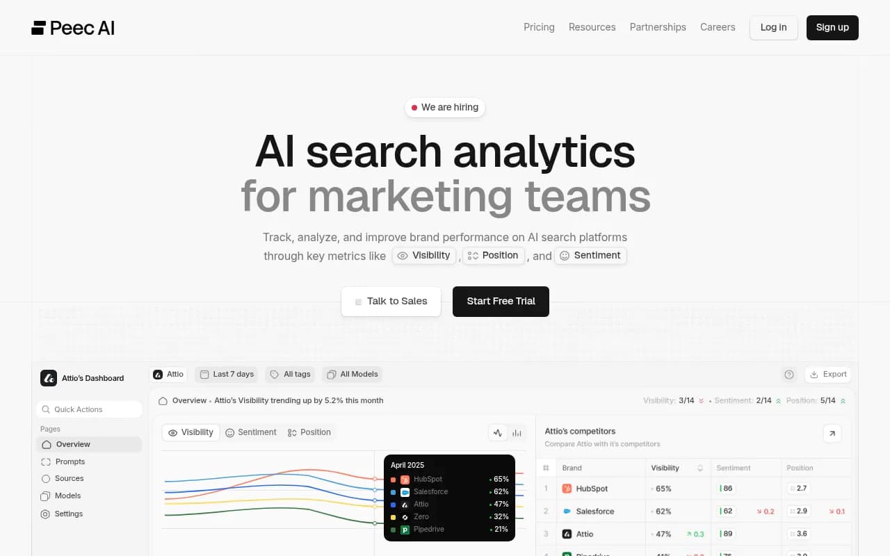
Peec AI has one of the cleaner interfaces in this category. The onboarding is quick, the main dashboard loads fast, and the core metrics -- brand mentions across AI engines, share of voice, competitor comparisons -- are presented without a lot of visual noise.
The platform's strength is speed. You can set up tracking for a new prompt set and see results within hours. The competitor heatmap view is well-executed: a grid showing which brands are winning which prompts across which AI models. It's the kind of view that works well in a client presentation or a team meeting.
Where Peec AI runs into trouble is the "now what?" moment. The data is clear, but there's no path from insight to action within the platform. You see that a competitor is cited 3x more often than you for a high-volume prompt. Great. Now you need to go figure out why, decide what content to create, write it somewhere else, publish it, and then come back to Peec to see if it helped. That's a lot of context-switching.
Mobile is adequate. The main metrics display fine, but the competitor comparison views get cramped on smaller screens. It's clearly designed for desktop use with mobile as a secondary consideration.
For teams that already have strong content operations and just need clean monitoring data, Peec AI's UX is genuinely good. The problem is that most teams buying AI visibility tools are trying to build those content operations, not supplement existing ones.
Profound: powerful but built for analysts, not marketers
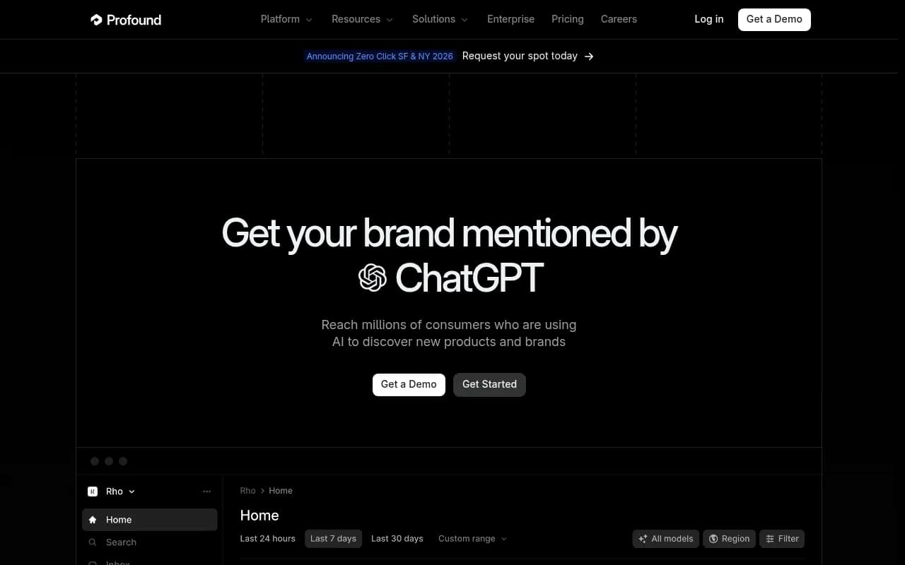
Profound is the most data-dense platform in this comparison, and that's both its strength and its UX challenge. At $499/month, it's targeting enterprise teams with dedicated analysts, and the interface reflects that assumption.
The dashboard surfaces a lot of information: citation counts, sentiment analysis, share of voice across multiple AI engines, topic-level breakdowns, and competitive positioning. For a senior analyst who lives in this data, it's genuinely impressive. For a content manager who logs in twice a week to check progress, it can feel overwhelming.
The onboarding experience is longer than competitors. Getting meaningful data out of Profound requires more configuration upfront -- defining your brand entities, setting up competitor tracking, configuring the prompt sets you care about. That's not necessarily bad, but it means the time-to-first-insight is longer than Peec AI or Otterly.AI.
One area where Profound's UX genuinely excels is the depth of its citation analysis. You can drill into specific AI responses, see the exact text that cited your brand (or didn't), and understand the context around each mention. That level of detail is hard to find elsewhere and is worth the complexity for teams that need it.
Mobile is where Profound struggles most. The interface was clearly built for large monitors. On a phone, many views require horizontal scrolling, and the data tables are essentially unusable without zooming. This isn't a dealbreaker for an enterprise tool, but it's worth knowing if your team expects to check in on the go.
Otterly.AI: the simplest dashboard, but almost too simple
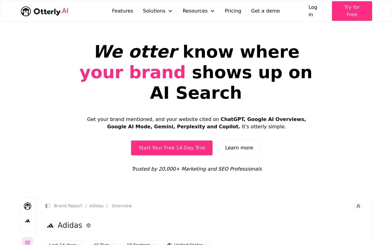
Otterly.AI sits at the budget end of this comparison at $29/month, and the UX reflects a deliberate choice to keep things simple. The dashboard is clean and loads quickly. You can see your brand's presence across AI engines, track a set of prompts, and compare against a handful of competitors.
For a small team or a solo marketer just getting started with AI visibility, Otterly's simplicity is genuinely appealing. There's very little to configure, very little to misunderstand, and the core metrics are front and center.
The limitation is that "simple" starts to feel like "limited" pretty quickly. There's no prompt volume data, no difficulty scoring, no content gap analysis, and no path to optimization. The platform shows you whether you're visible -- it doesn't help you understand why or what to do about it.
The mobile experience is basic but functional. The main visibility metrics display fine on a phone. There's not much to show, so there's not much to break.
For teams that are just starting to think about AI visibility and want a low-cost way to get a baseline, Otterly.AI is a reasonable starting point. But most teams outgrow it within a few months and end up needing a platform with more depth.
Rankshift: minimal interface, minimal insight
Rankshift has a stripped-down interface that prioritizes simplicity. The setup is fast, the core tracking works, and the dashboard is uncluttered. But "uncluttered" here is partly because there isn't much to show.
The platform lacks the depth of competitor analysis, prompt intelligence, and content optimization features that the other tools in this comparison offer. The UX is clean by default because the feature set is narrow.
For teams that need basic AI citation tracking and nothing else, Rankshift is functional. But in a category that's moving fast, the lack of investment in analytics depth and action-oriented features makes it hard to recommend over alternatives that cost a similar amount.
Mobile is minimal -- the interface works on a phone but offers little beyond what you'd see on desktop, which is itself limited.
Head-to-head UX comparison
Here's how the five platforms compare across the dimensions that matter most to marketing teams:
| Dimension | Promptwatch | Peec AI | Profound | Otterly.AI | Rankshift |
|---|---|---|---|---|---|
| Time to first insight | Fast | Very fast | Slow (config required) | Very fast | Fast |
| Dashboard clarity | High | High | Medium (data-dense) | High | High |
| Mobile usability | Good | Adequate | Poor | Basic | Minimal |
| Action-oriented UX | Strong (gap analysis + content gen) | Weak | Weak | Weak | Weak |
| Onboarding complexity | Low | Low | High | Very low | Very low |
| Depth of analytics | High | Medium | Very high | Low | Low |
| Content workflow | Built-in | None | None | None | None |
| Prompt volume data | Yes | Limited | Yes | No | No |
| Competitor heatmaps | Yes | Yes | Yes | Basic | No |
| AI crawler logs | Yes | No | No | No | No |
The pattern is pretty clear. Profound wins on raw data depth. Peec AI and Otterly.AI win on simplicity and speed. Promptwatch is the only platform that combines meaningful analytics depth with an action-oriented UX and a built-in content workflow.
What real marketing teams actually care about
The teams that get the most value from these platforms tend to share a few characteristics. They have a clear owner for AI visibility (usually someone in SEO or content). They run a regular cadence of checking the dashboard -- weekly at minimum. And they have a process for turning insights into published content.
That last point is where most platforms fall short. Monitoring is easy to sell but hard to act on. A dashboard that shows you're losing visibility to a competitor is useful. A dashboard that shows you exactly which prompts you're losing, estimates the traffic opportunity, and then helps you create the content to win those prompts -- that's a different category of tool.
The UX implications of this are significant. An action-oriented platform needs more UI surface area: content brief generators, article editors, publishing integrations, performance tracking at the page level. That's more complex to build and more complex to navigate. Promptwatch has made that investment; the others in this comparison largely haven't.
Which platform should you choose?
The right answer depends on what your team actually needs:
If you're an enterprise team with dedicated analysts who need maximum data depth and are willing to invest in setup and training, Profound's analytics are hard to beat -- just don't expect a smooth mobile experience or a path to content creation.
If you're a small team or agency that needs quick, clean monitoring across a handful of brands without a lot of configuration overhead, Peec AI or Otterly.AI will get you up and running fast. Peec AI has more depth; Otterly.AI has a lower price point.
If you need a full workflow -- from identifying gaps to creating content to tracking whether it worked -- Promptwatch is the only platform in this comparison that supports that end-to-end. The dashboard is well-designed, the mobile experience is the best of the group, and the action-oriented UX means your team spends less time staring at charts and more time actually improving your AI visibility.
For most marketing teams in 2026, that last scenario is the one that matters. Knowing you're invisible in ChatGPT is step one. Having a tool that helps you fix it is the actual goal.
Bottom line
Dashboard UX in AI visibility tools is still maturing. Most platforms were built to answer the question "where do I appear?" rather than "what should I do next?" That gap between monitoring and optimization is where the real UX differences show up.
Promptwatch has built the most complete answer to that second question. Profound has the deepest data for teams that can handle the complexity. Peec AI and Otterly.AI are solid entry points for teams that just need clean monitoring. Rankshift is functional but limited.
The best platform for your team is the one your team will actually use consistently -- and that means the one whose UX matches how your team works, not just how it looks in a demo.