Key takeaways
- No third-party roundup I found tests native iOS or Android apps or tablet layouts for AI visibility tools. Any "best mobile experience" ranking you read is probably guesswork.
- Most of these platforms are web dashboards. What matters is responsive layout, readable tables and charts, and whether alerts and reports reach your phone without you logging in.
- Delivery channels often beat the dashboard itself on mobile: Slack briefings, email digests, PDF reports and Looker Studio views.
- Test any tool on your own phone and tablet during the trial, using the checklist below, before you sign an annual plan.
- Promptwatch is a sensible shortlist candidate because of its Slack briefings, weekly digest emails and scheduled PDF reports, but verify the phone experience yourself.
The honest starting point
I went looking for a ranking of AI visibility platforms by mobile and tablet experience. It does not exist. The comparison pages I reviewed, including the Shadow guide, the Zapier roundup and the accessibilitychecker.org list, cover engine coverage, pricing, citations, and content features. None of them document native apps or tablet layouts.
So this guide does something different. Instead of inventing a leaderboard, it explains what good mobile and tablet use looks like for this category, which product traits make it easier, and how to test a tool in an afternoon. I have not verified any vendor's phone or tablet behaviour, and I will flag where you need to check.
Why mobile matters less (and more) than you think
AI visibility work is mostly desk work. You build prompt sets, compare competitors, read cited sources and plan content. Nobody is rewriting a content brief on a phone.
But there are moments where mobile genuinely matters:
- A client or executive asks "how are we doing in ChatGPT?" while you are in a meeting or on a train.
- A sentiment drop or a competitor taking your citation slot needs a quick check.
- You review a weekly report on a tablet at home or in a conference room.
- An agency account manager pulls up a client dashboard live during a call.
That is read-heavy, glance-heavy use. So the question is not "can I do everything on a phone" but "can I check, share and triage on a phone."
What a good mobile and tablet experience looks like
Responsive charts and tables
AI visibility dashboards are full of heatmaps, trend lines and wide tables with columns for model, prompt, position, sentiment and cited source. These break easily on small screens. On a phone you want horizontal scrolling that does not lose the first column, charts that respond to touch, and filters that do not eat half the screen.
The data itself also affects design. Promptwatch Data's analysis of sources per response shows ChatGPT citing about 5 sources per web-search answer while Google AI Overviews and Perplexity cite about 10, and Copilot swings wildly. A compact mobile view should show per-engine numbers rather than one blended score, because the engines behave differently.
Notifications and digests
The best "mobile experience" for a monitoring tool is often not an app at all. It is a Monday email, a Slack message or a scheduled PDF that lands where you already are. If a tool can push a summary to you, you rarely need to open the dashboard on a small screen.
Sharing and read-only access
Tablets are good for presenting. Look for shareable links, white-label PDF exports, and read-only client access that works without a seat-heavy login flow.
Login and session behaviour
Small things add up: single sign-on that works in mobile browsers, sessions that do not time out mid-meeting, and no forced desktop-only modals.
Delivery channels compared
Since native apps are not documented, here is how the common delivery routes stack up for mobile use. Specific vendor support varies, so check each product's integrations page.
| Delivery route | Phone friendliness | Tablet friendliness | Best use |
|---|---|---|---|
| Responsive web dashboard | Depends on vendor | Usually fine | Quick checks, light filtering |
| Slack briefings | Excellent | Excellent | Daily or weekly summaries |
| Email digests | Excellent | Excellent | Passive monitoring |
| Scheduled PDF reports | Good (pinch and zoom) | Very good | Client and executive reporting |
| Looker Studio views | Fair to good | Good | Custom blended reporting |
| Chat assistant (in app or Slack) | Good | Good | Asking questions on the go |
Platforms worth testing on your phone and tablet
The tools below are not ranked for mobile quality, because I could not verify that. They are chosen because their delivery options or positioning make them reasonable candidates to trial.
Promptwatch
Promptwatch is an AI visibility and optimization platform, and several of its features suit mobile-first habits. Agent Chat can deliver scheduled briefings in-app or in Slack, a weekly digest email goes out every Monday, and dashboards can be exported as PDF or scheduled PDF reports with white-label branding. Looker Studio and a hosted MCP server are available for teams that want to pull data into other tools. That means you can stay informed from a phone without opening the full dashboard.
It also goes beyond tracking: the Action Board gives you a prioritised to-do list, and the Content Agent can publish to Webflow, Framer or WordPress. I have not tested the dashboard on a phone, so run it through the checklist below during the 7-day trial on monthly Essential, Professional, Kick-off and Growth plans, and confirm current pricing at promptwatch.com/pricing.
Profound
Profound is the usual enterprise pick, with a free 7-day trial and then custom pricing. Its agency mode includes brand configurations and pitch environments, which matters if you present to prospects on a tablet. Whether the interface is comfortable on small screens is something to test.
Peec AI
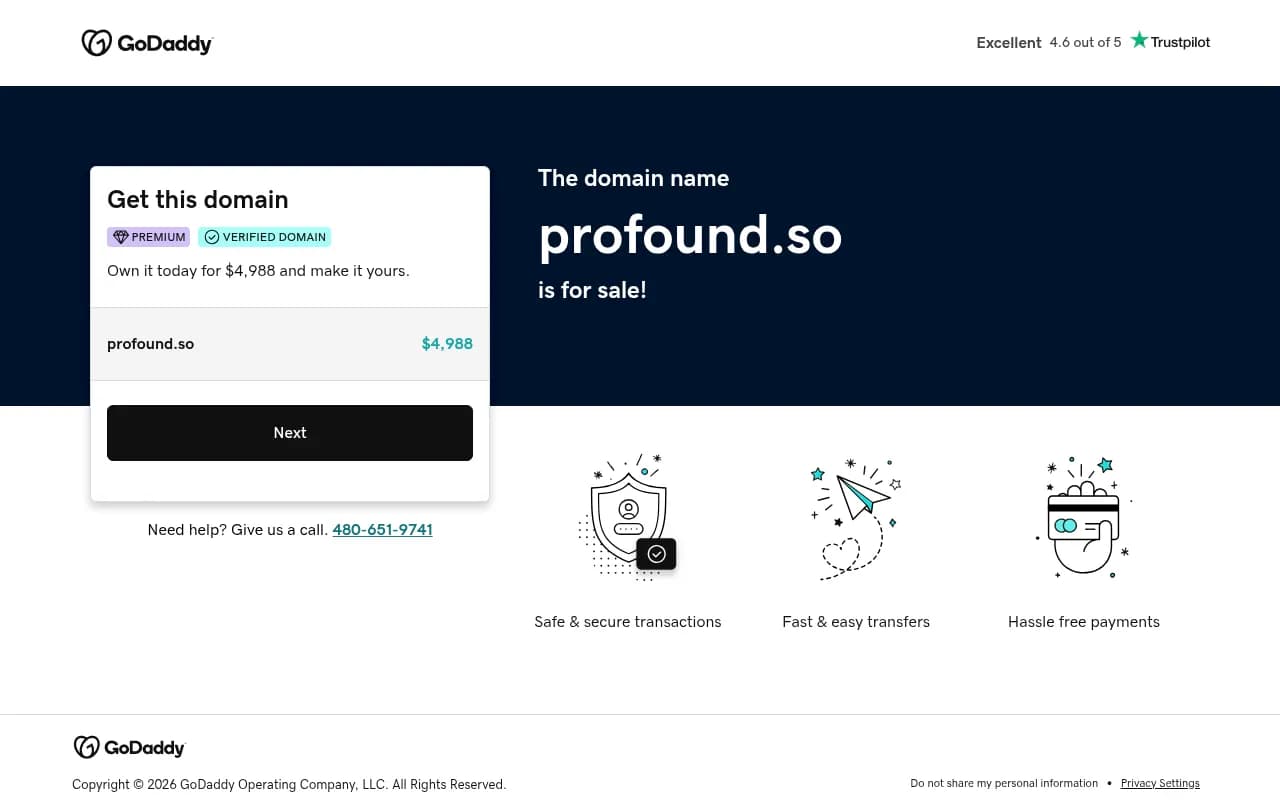
Peec AI starts at $95 per month for 50 prompts across 3 models, with MCP on all plans. It is popular with mid-market teams and agencies. Because it collects answers by mimicking real browser sessions, its data is close to what users see, but again, its mobile layout is unverified here.
Otterly.AI
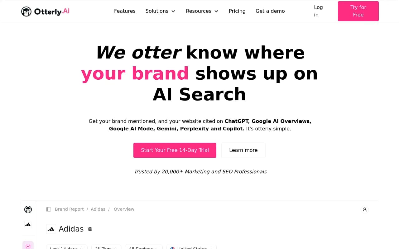
Otterly.AI is the cheapest way to start, and it is also available as an app inside the Semrush App Center. If your team already lives in Semrush, that may be a smoother route than learning a standalone dashboard.
Semrush
The Semrush AI Visibility Toolkit costs $99 per month per domain billed annually, for 25 prompts. Semrush has a long-established product ecosystem, so check how its reporting behaves on a tablet.
Ahrefs Brand Radar
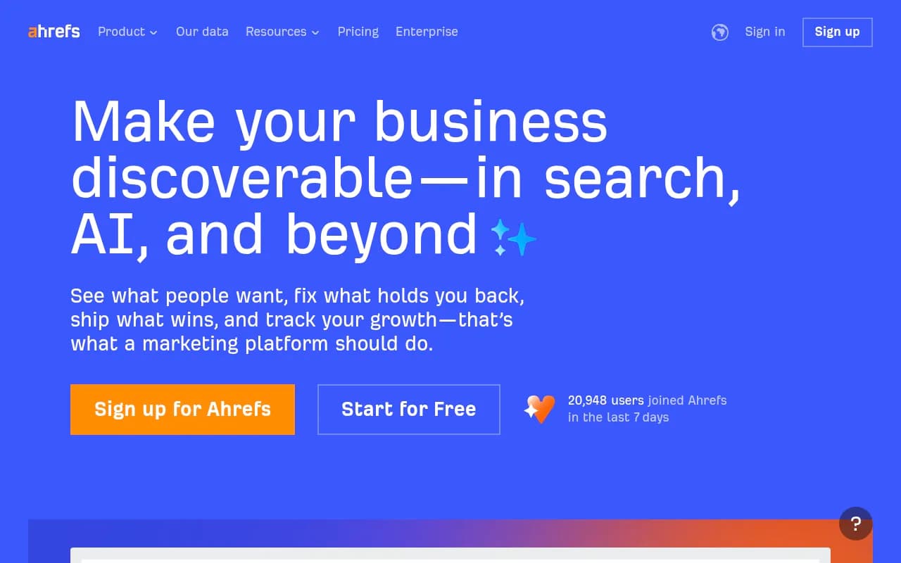
Ahrefs Brand Radar gives you a single dashboard across AI engines plus YouTube, TikTok and Reddit mentions. A unified view can be easier to read on a small screen than several tabs.
ZipTie
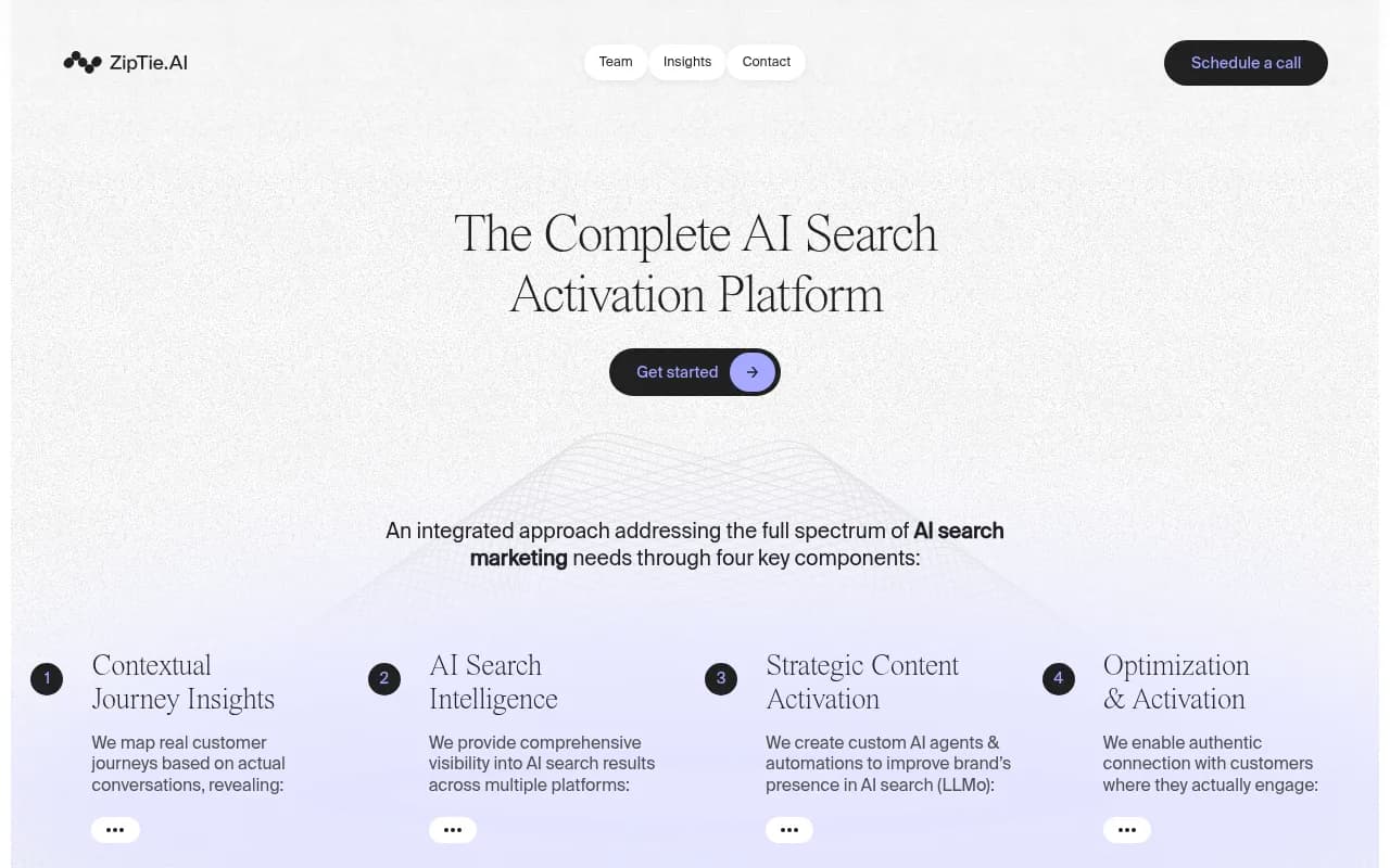
Zapier's roundup recommends ZipTie for deep analysis and reporting. Deep analysis often means dense tables, so test it on a tablet rather than a phone.
For a wider list, the GEO software directory at bestgeosoftware.com is a good place to browse more options.
A 30-minute mobile and tablet test
During any free trial, run the same checks on each tool. Use your real phone and a real tablet, not browser dev tools.
- Log in using the same method your team will use, including SSO or two-factor.
- Open the main visibility dashboard on your phone in portrait mode. Can you read the headline metric without zooming?
- Open a table of prompts or citations. Can you scroll sideways without losing the row label?
- Tap into a single chart. Do tooltips work with touch, or do they require hover?
- Apply a filter by model, country or date range. Is it one tap or five?
- Open a response detail and read the cited sources. Are the links tappable and readable?
- Export or share a report, then open the result on your phone.
- Set up one notification, whether Slack, email or push, and see how it looks when it arrives.
- Rotate the tablet to landscape and check that layouts use the extra width instead of just stretching.
- Try it on a poor connection. Heavy dashboards can crawl on mobile data.
Score each step as pass, awkward or fail. Two or more fails on the actions you do most often is a real signal.
What to choose depending on how you work
Executives and CMOs
You mostly want a glance. Prioritise Slack or email summaries and clean PDF reports. Skip tools whose value is locked in a complex dashboard.
Agencies
You present on tablets and phones, often to clients. White-label PDFs, branded read-only access and pitch environments matter more than native apps. Promptwatch's agency plans include custom reports and branded client access, and Profound's agency mode is aimed at the same use case.
In-house SEO and content teams
You work at a desk, so mobile is a convenience. Pick on data quality and action tooling first, then use the test above as a tiebreaker.
Small budgets
Otterly.AI and Peec AI are the usual starting points. Free options like Amplitude AI Visibility are fine for one-off checks, though a phone-friendly interface is not guaranteed.

Questions to ask vendors
If a vendor claims a strong mobile experience, ask for specifics:
- Is there a native iOS or Android app, or is it a responsive web app?
- Which dashboard widgets are hidden or simplified on small screens?
- Can I receive scheduled summaries in Slack and email?
- Can I export a branded PDF from a phone?
- Does the AI assistant or chat work on mobile, if it has one?
A vendor with a real answer is a good sign. A vendor that pivots to talking about features is telling you something too.
Bottom line
There is no verified winner for mobile and tablet experience in AI visibility tools, and anyone who names one without showing their testing is guessing. Treat mobile as a tiebreaker after data coverage, action tooling and price. Shortlist two or three platforms, run the 30-minute test on your own devices, and favour tools that push insight to Slack, email or PDF so you are not forced to squint at a dashboard on a train.